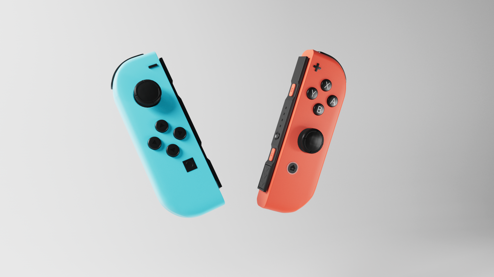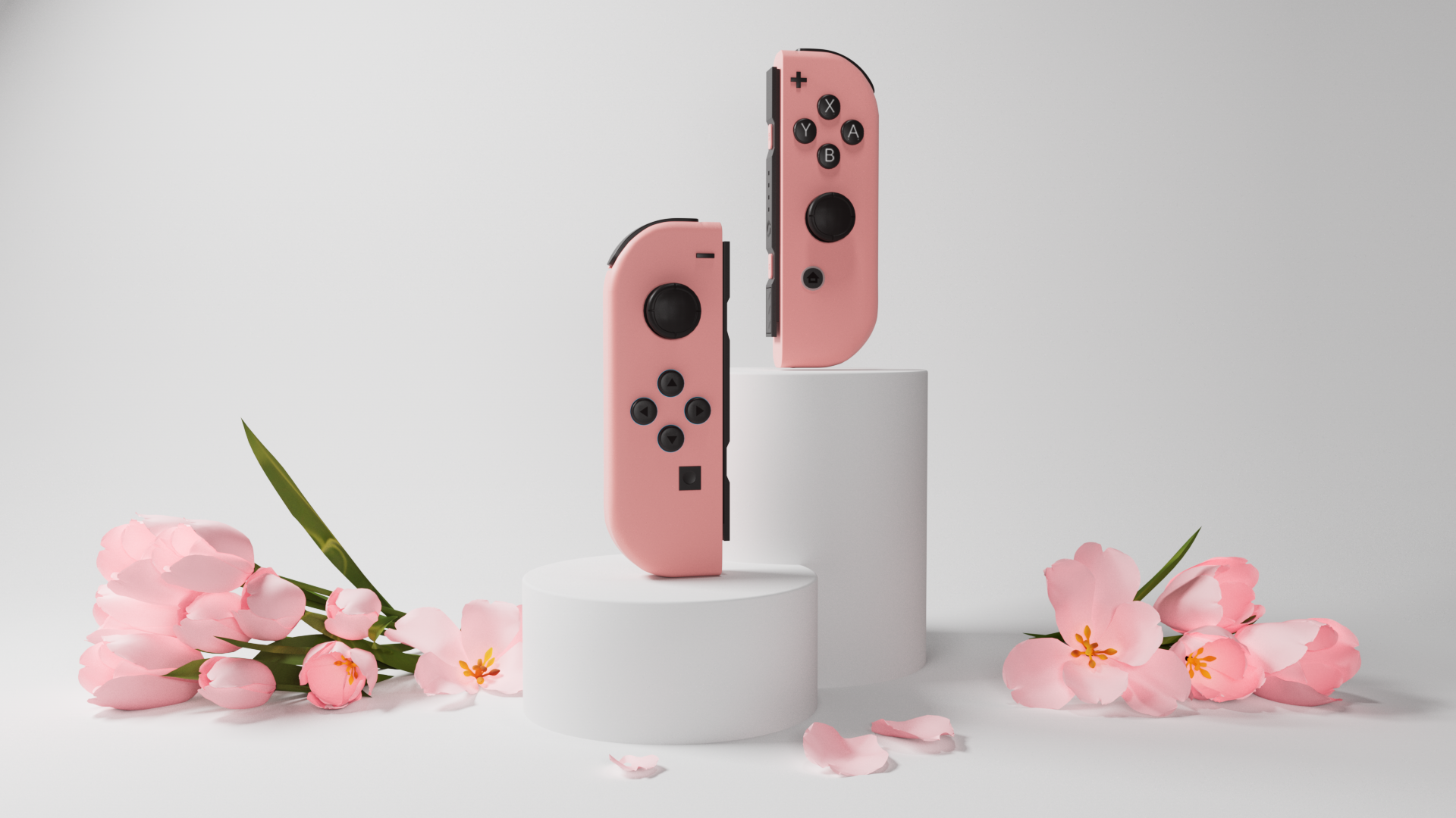
This was a quick product render project I embarked upon in honor of Nintendo releasing their new product, the pastel pink-colored Nintendo Switch Joycons, on March 22nd. This color has been long awaited, particularly since most of the Switch joycon colors are bright neons rather than pastels.
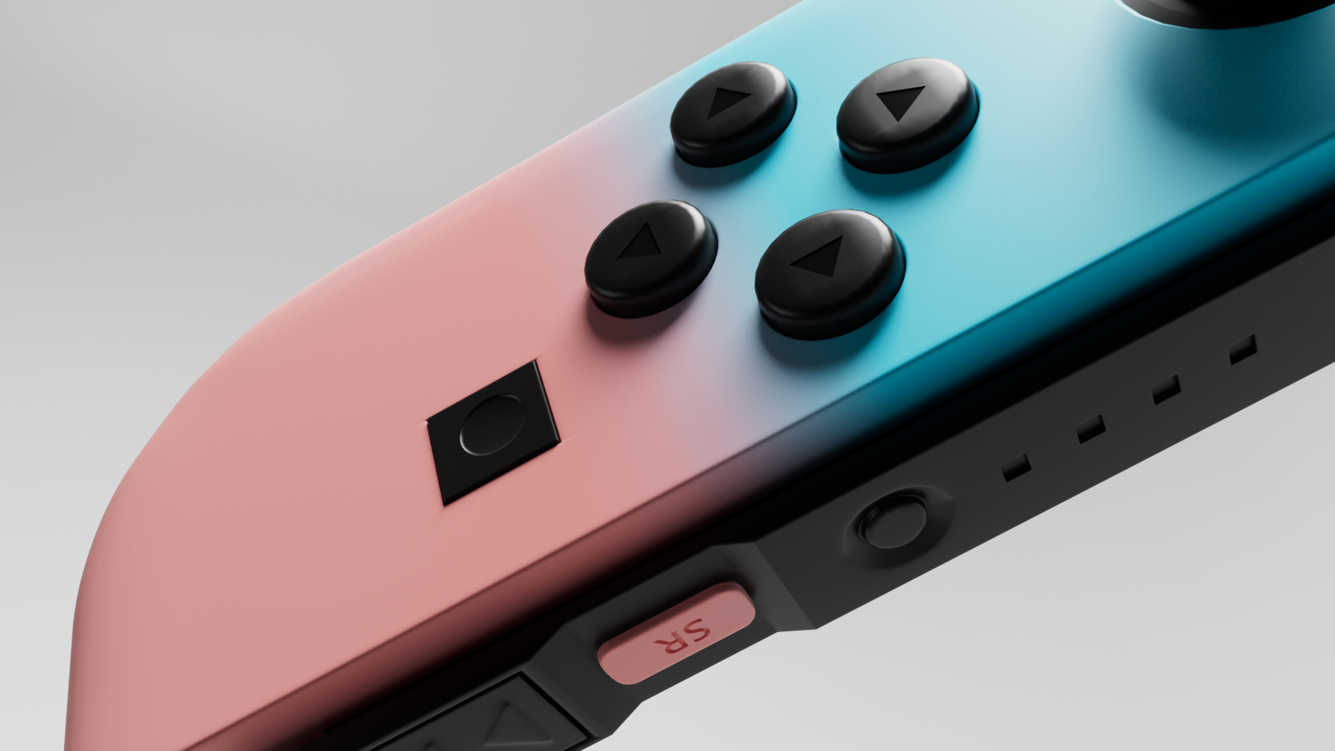
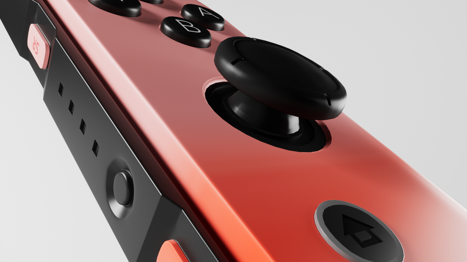
As such, I wanted to show this transformation of the original, iconic Nintendo Switch joycon colors to the new, soft pastels. By having a neutral background color, consistent, bright lighting, and extreme close-up shots, I wanted the emphasis of this product render to be on the most important part: the color. The product is functionally identical in both states; the important part, and the aspect that Nintendo has marketed the most, is the fact that it is in a new color.
This was created entirely in Cinema4D and rendered out of Redshift, with compositing in After Effects. The joycon textures were built entirely within C4D's nodal material system, with decals and button information created in Illustrator and layered on top of them.
It is important to note I did not create this for Nintendo as a client; this was an independent project inspired by their product.